Streamlining Agri-Input Sales: 30% Engagement Hike
and 20% Revenue Boost
Quick Overview
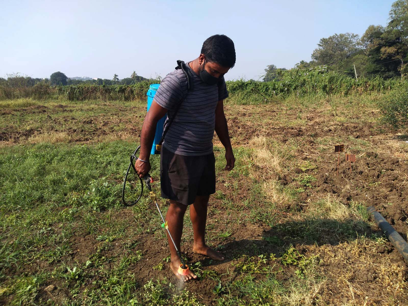
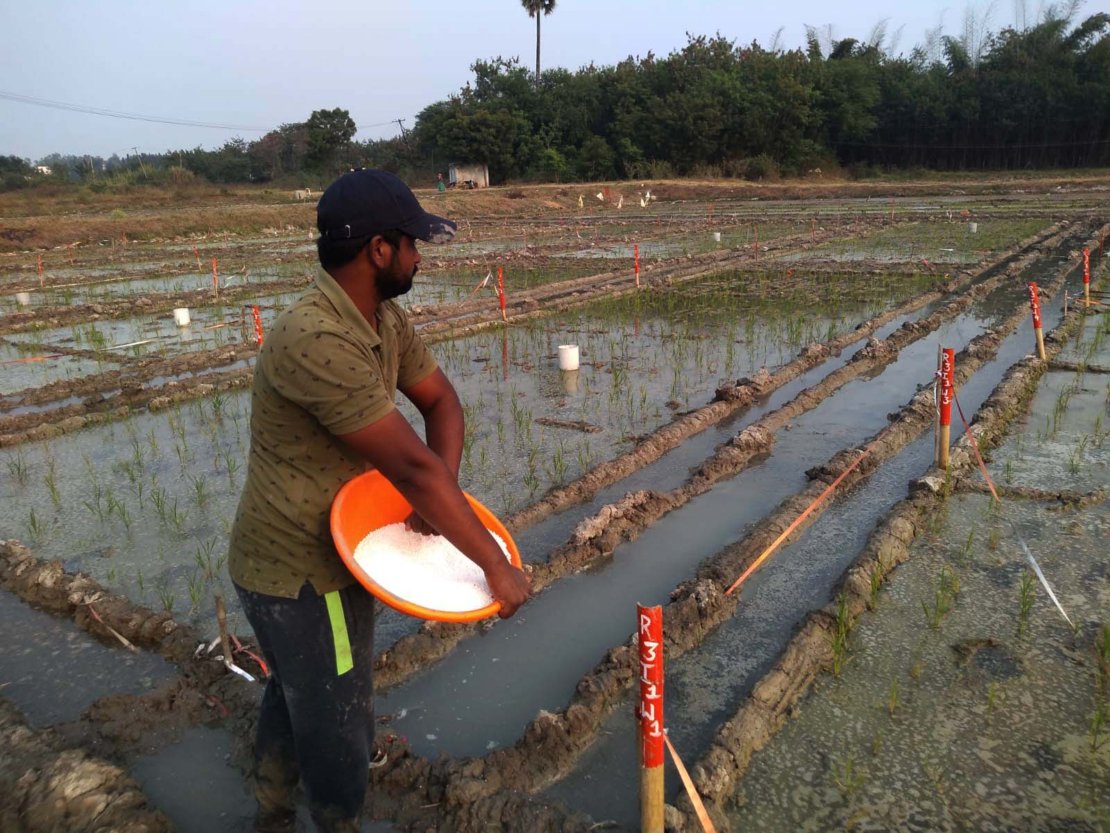
Farmer App by Samhitha Crop Care Clinics offers personalized crop advisory for farmers. A team of agri-experts, including plant doctors and soil scientists, provide continuous tree-level monitoring and localized recommendations using data from field, sensors, and drones. Integrated services like soil testing and tree tagging ensure comprehensive crop management. The app empowers farmers with actionable insights for optimized yields.
user experience designer
My Role
Product & business growth
category
Team
Responsibilities
As the UX designer, I managed the design process, worked with product managers to understand requirements, and consulted with agriculture experts to create detailed crop guides. I coordinated with developers to ensure smooth development and conducted user testing to confirm the usefulness of the guides and product recommendations.
Research & Ideation
Strategy
Introduction
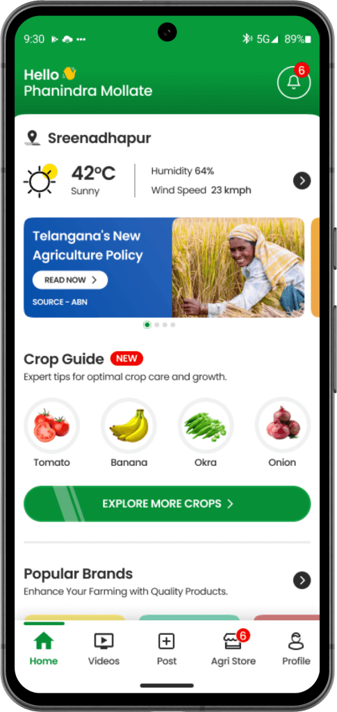
I was tasked with creating a “Crop Guide” feature for a farmer's app that would not only provide comprehensive crop information and pest/disease management solutions but also streamline the sales of associated agricultural inputs like fertilizers, pesticides, and equipment. The goal was to build a valuable resource addressing farmers' needs while boosting engagement and revenue from agri-input sales.
Team's Creative Solutions
We chose to gather ideas from our entire team, including engineers, marketers, and agricultural experts. Our goal was to create a user-friendly and practical app. Here are the solutions we developed:
Comprehensive Crop Information
Solution - 1
Integrated Sales for Agricultural Inputs
Solution - 2
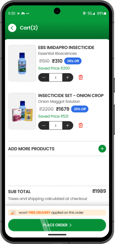
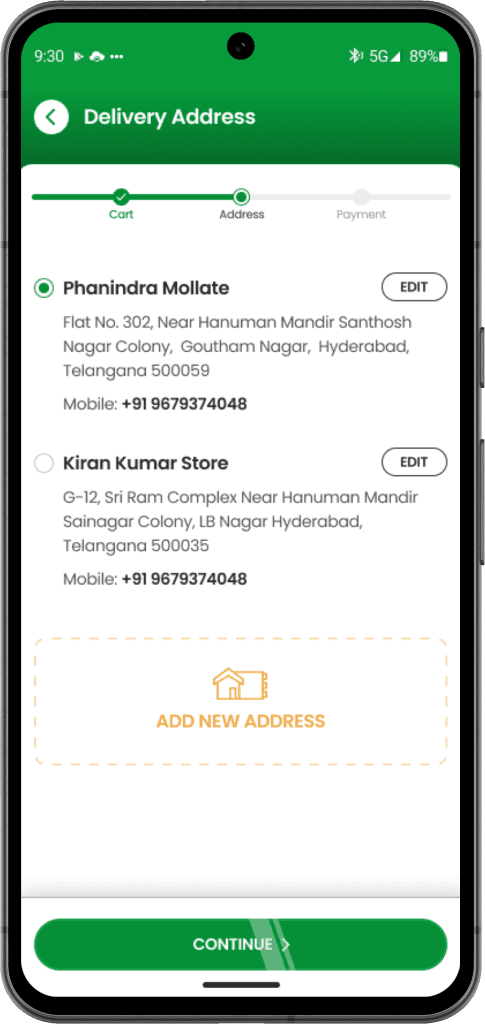
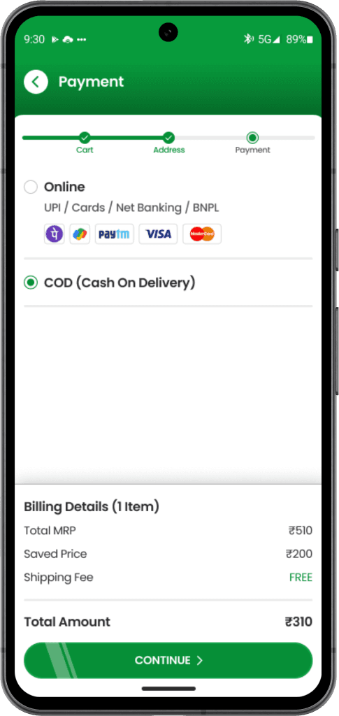
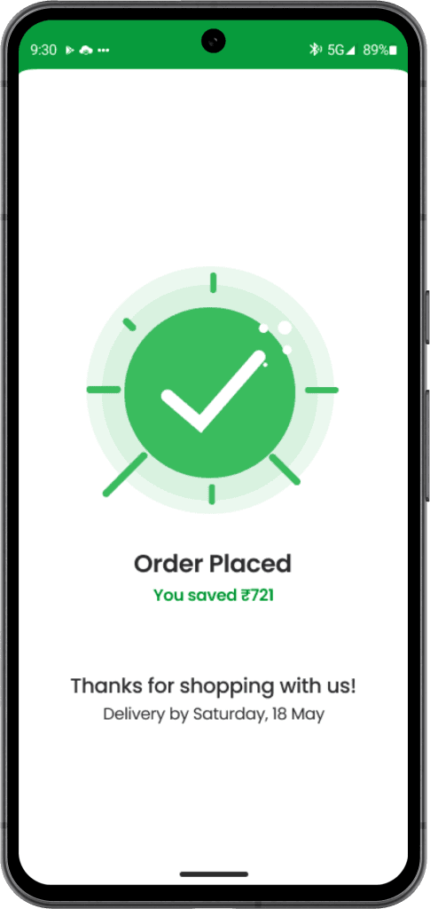
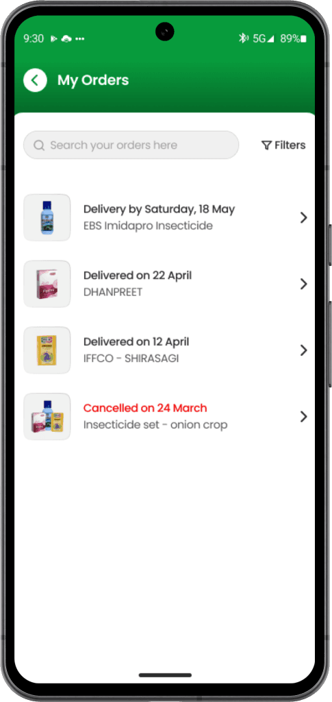
Incorporate an easy-to-use purchasing system within the crop guide feature. Farmers can quickly buy recommended fertilizers, pesticides, and equipment directly from the app.
User Research
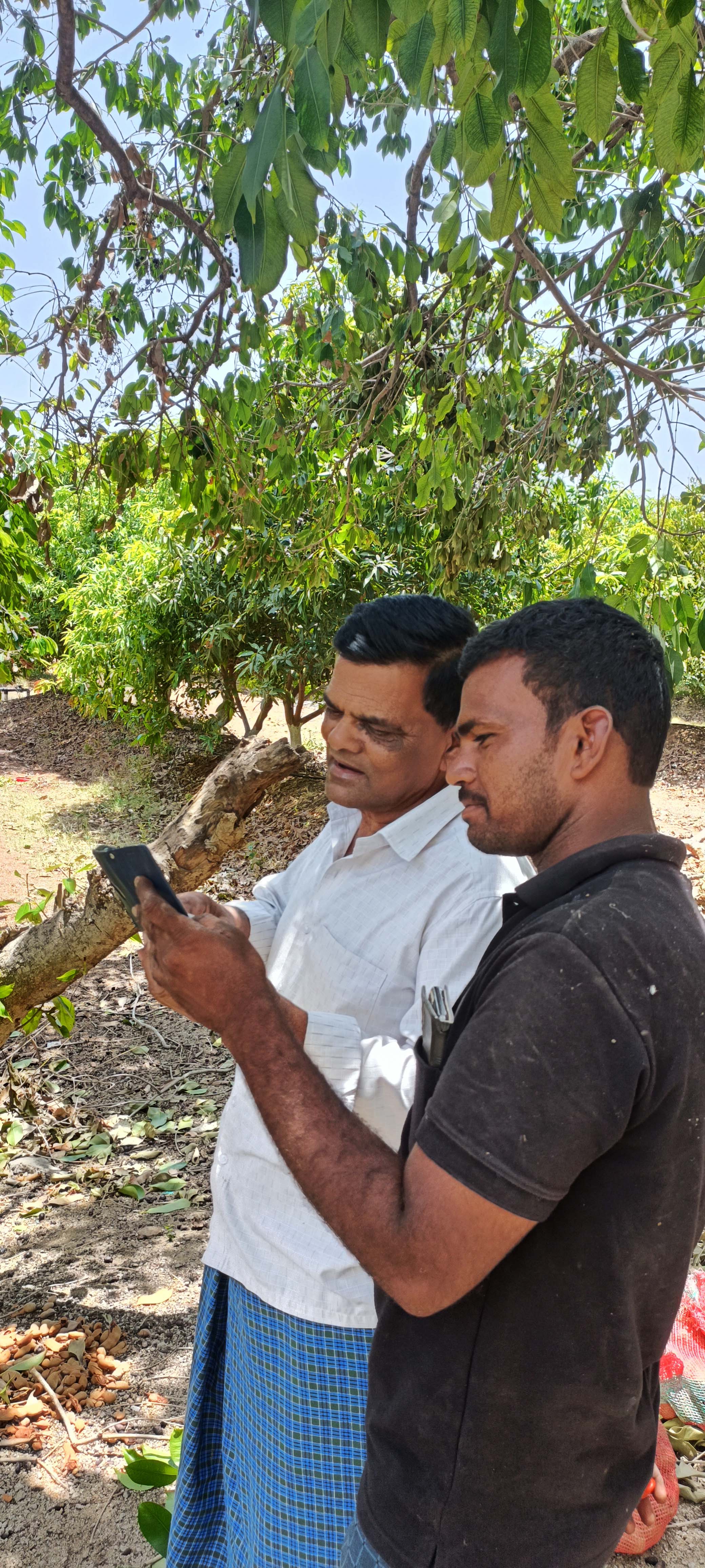
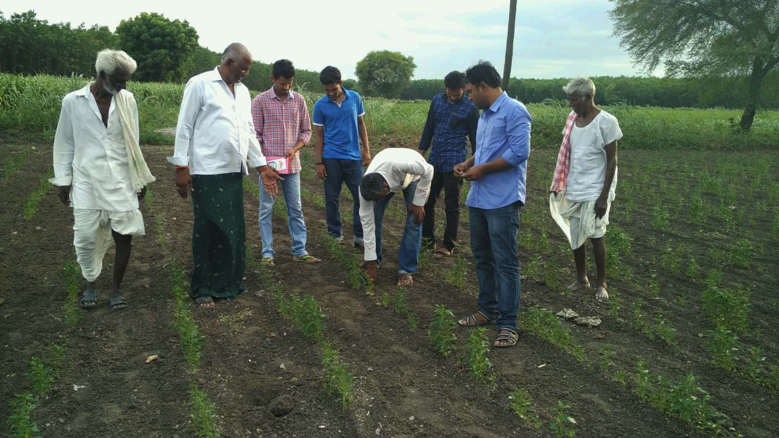
While our team had many exciting ideas, it was important to ensure those ideas resonated with the actual users - the farmers. To understand their perspectives, I collaborated with my Product Manager and interviewed 15-20 farmers. We asked them simple questions like:
What farmers told us - Interesting insights
Talking directly to farmers gave us important insights . These are some of their responses:
P. dhanunjaya Reddy
Telangana

Finding all the information I need for my crops in one place is really difficult.
Want to know exactly what problems to look out for at each stage of the crop cycle.
G. Srikanth Reddy
Telangana


It's hard to decide which pesticides, fertilizers, or other products are best for dealing with different issues.
I need one place telling me what problems to watch for and which products to use.
T. Suresh Babu
Andhra Pradesh

Want advice on managing pests and diseases at different stages of crop growth.
I prefer recommendations for organic or eco-friendly product options when possible.
We team decided to have “Crop guide with Integrated Agricultural Inputs”
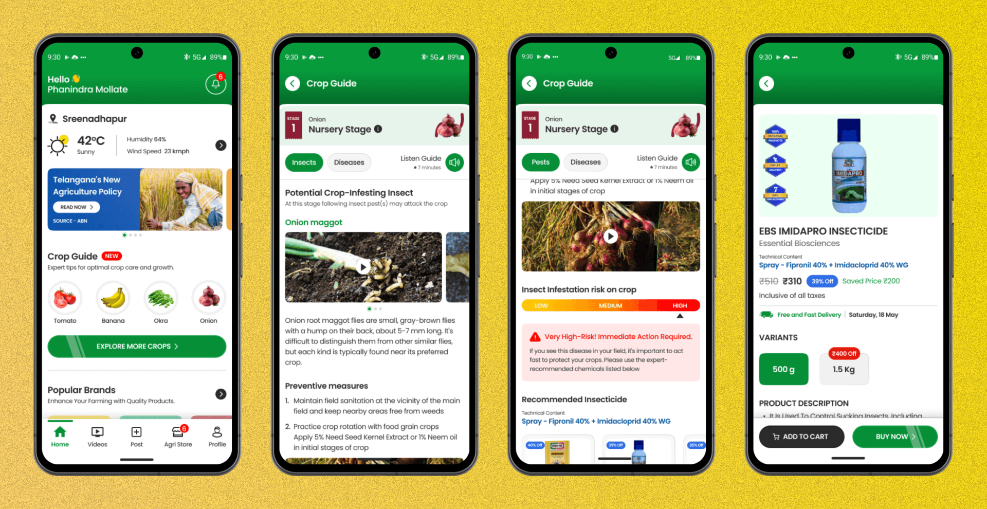
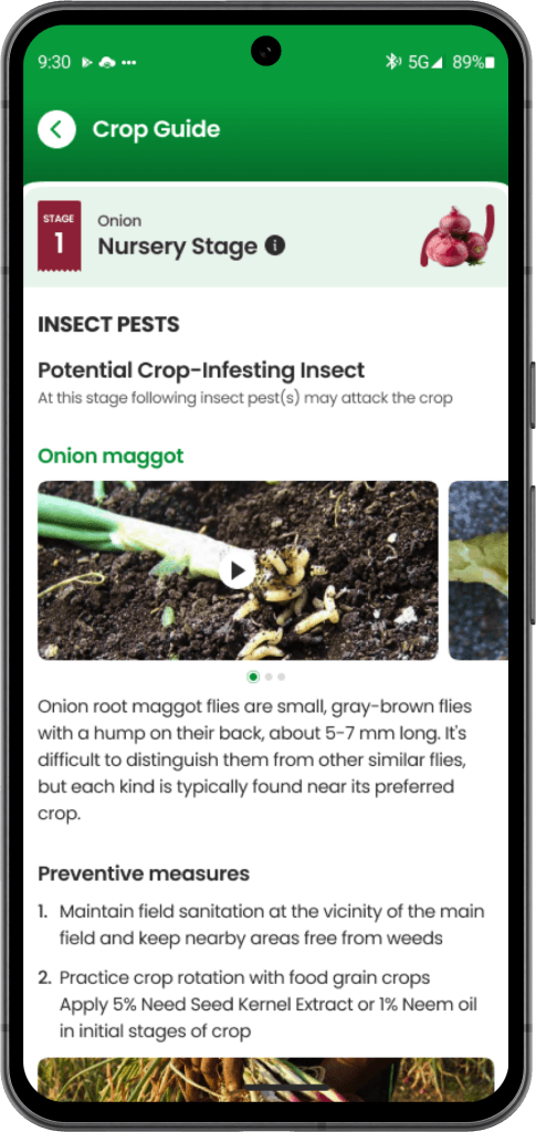
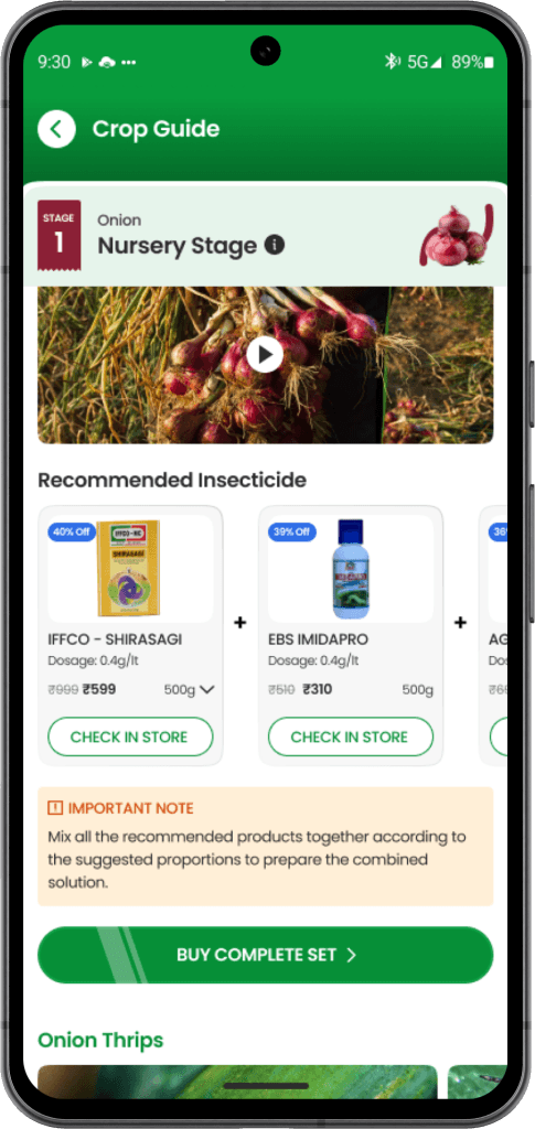
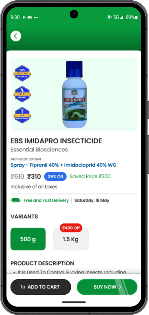
Add a simple purchasing system to the crop guide feature. Farmers can view detailed crop information and pest management advice. This helps farmers make informed decisions and manage their crops effectively. It also lets them quickly buy recommended fertilizers, pesticides, and equipment directly from the crop guide screen.
DECIDING FACTORS
crop-specific information
Challenges we faced
Finding all the information we need for crops in one place is hard. We can't rely on random data from the internet. We want to provide the best solutions for our farmers.
Consolidating Information
point - 1
Gathering and organizing comprehensive, accurate crop-specific information in one place.
Ensuring the information is easy to navigate and understand for farmers
point - 2
Providing detailed, stage-specific guidance for each crop.
Making sure the guidance is clear and actionable at every stage of the crop cycle.
Product Recommendations
point - 3
Identifying and recommending the best pesticides, fertilizers, and other products for specific issues.
Ensuring the recommendations are reliable and tailored to different crops and problems.
point - 4
Providing localized information that caters to the specific needs and conditions of different regions.
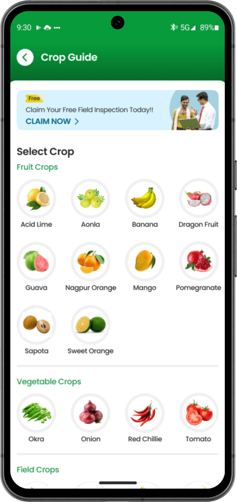
User Flow
From crop selection to accessing relevant crop guidance, with agri-input purchases integrated at each stage based on the specific issues and growth phases.
Wireframing and Sketching
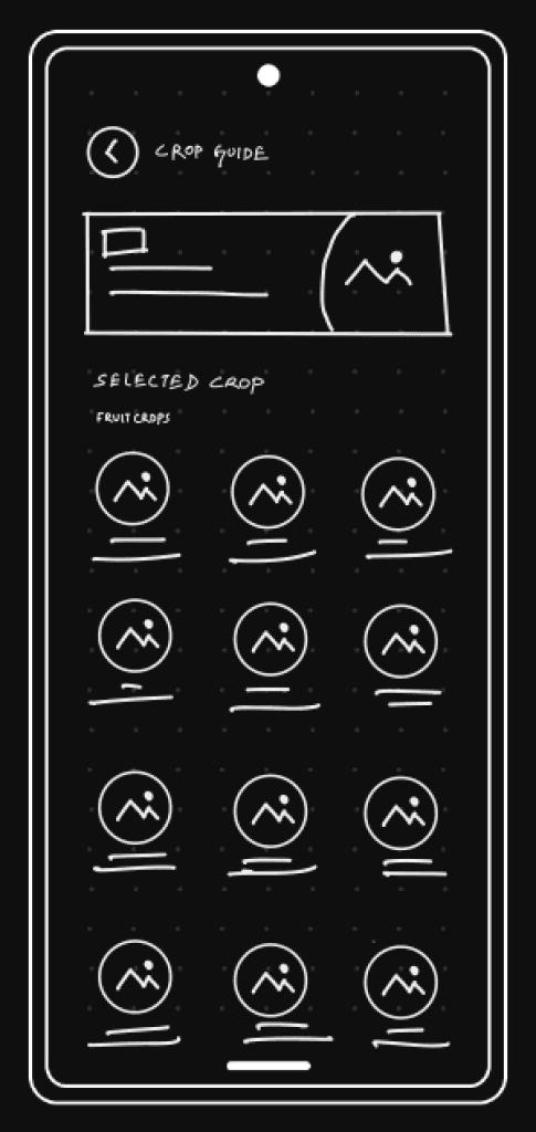
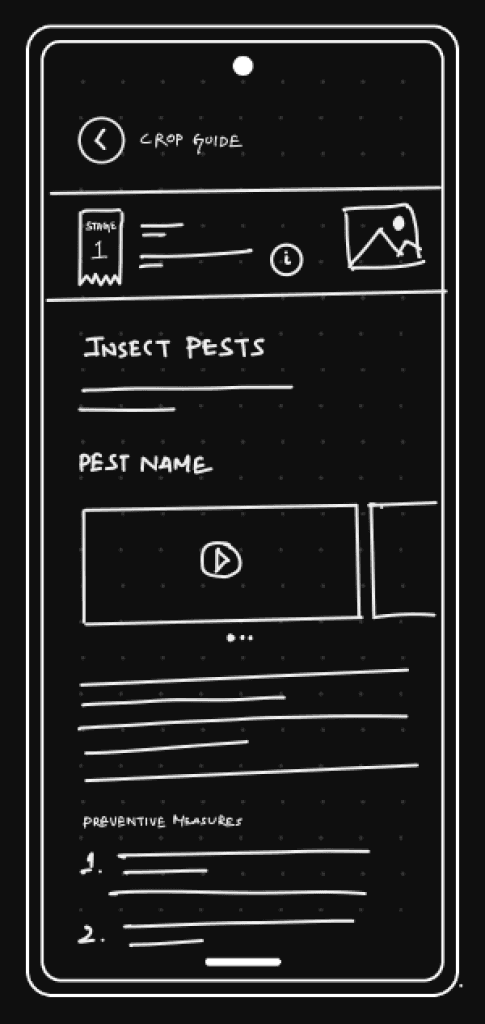
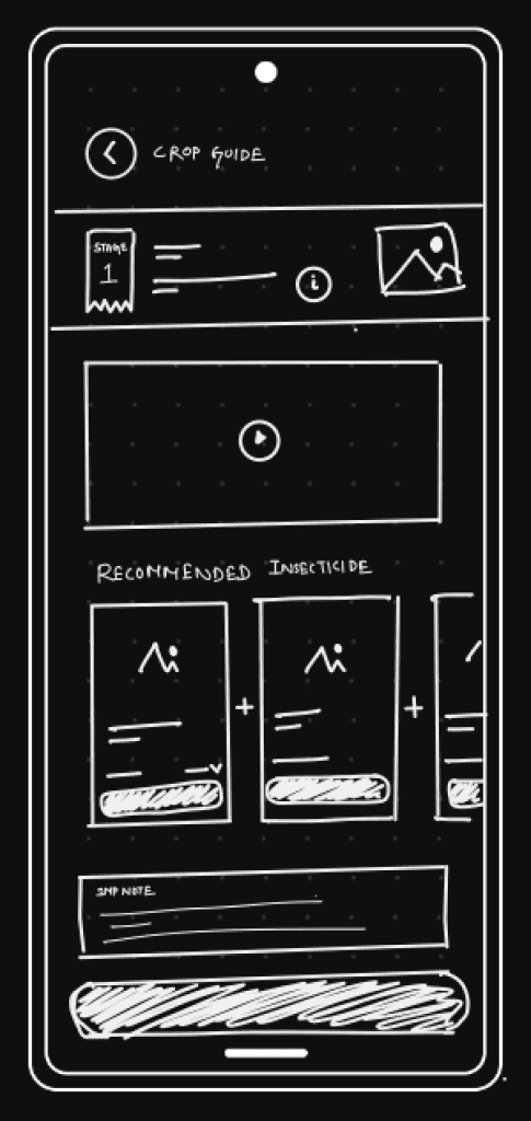
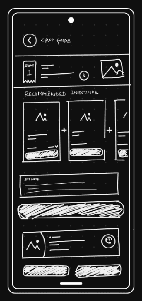
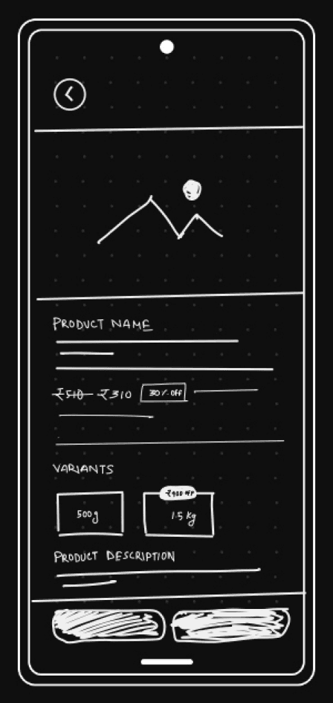
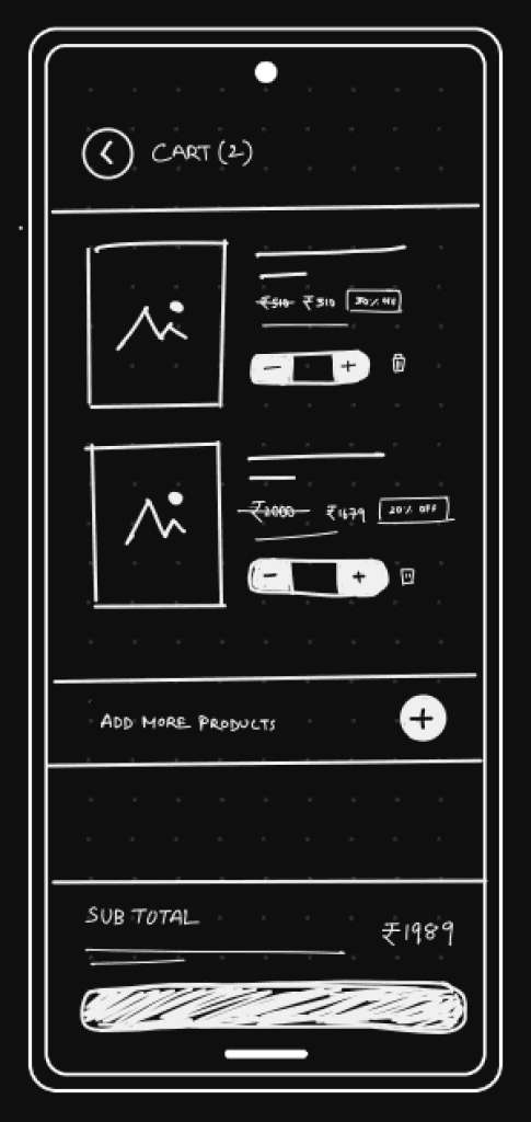
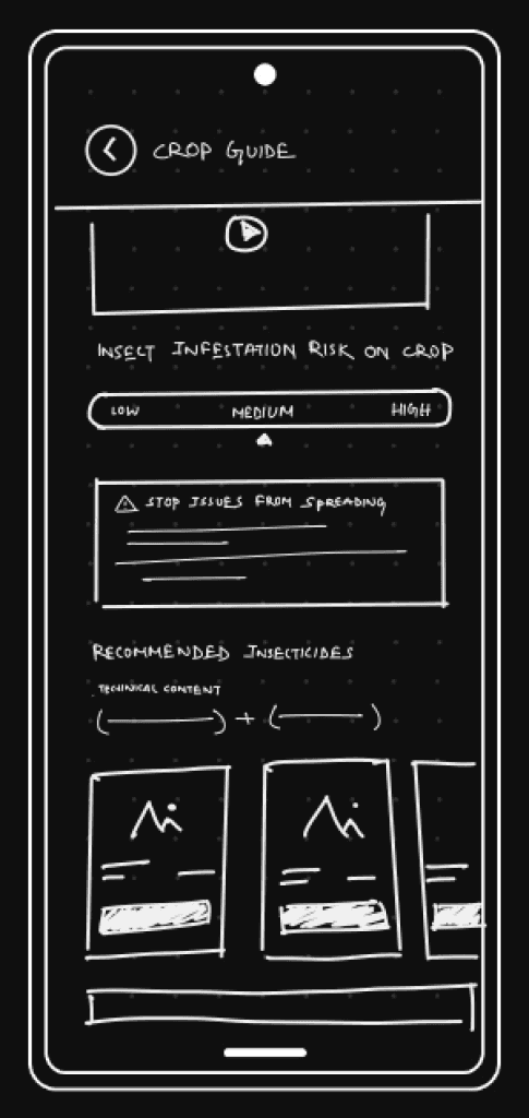
I started with simple wireframes. Sketching helped me see the page layout and find any problems users might have, so we could discuss and fix them.
High-Fidelity Wireframes
These high-fidelity wireframes (detailed mock-ups of the app's design) were used early in the design process to test and validate how well the design works.
Usability Testing & Iterations
During usability testing, some problems were found with the design flow. Below are the issues identified by users, along with the updated designs that solved those problems.
01. Crop Guide Content Structure
Problem
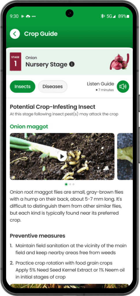
The way the content was organized, users had to scroll through long sections to switch between information on insect pests and diseases. This made it confusing for users to determine whether they were viewing guidance for insect pest issues or disease problems.
We had to keep in mind that our app wasn't just for new generation farmers but also for experienced farmers who were new to using tech in agriculture.
Solution
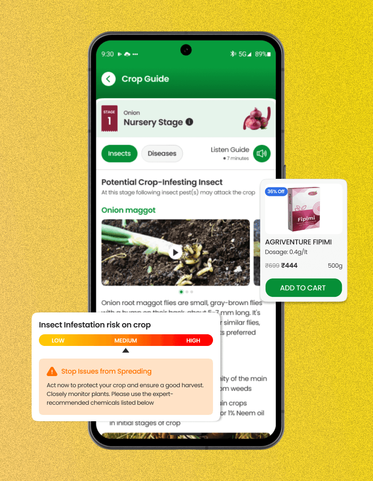
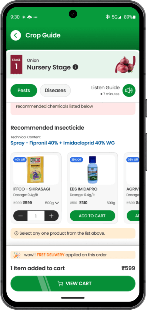
We made tabs to switch between insect pests and diseases. The active tab shows users what content they are viewing.
We shortened the content to only what's necessary and added a "Listen Guide" button for users who prefer listening.
02. Product Selection
Problem
The initial approach of listing recommended products as a package, and the risk of an incomplete/ineffective solution if any item was missed.
The potential issue of this approach discouraging purchases, as it felt overly demanding rather than offering a convenient solution.
Solution
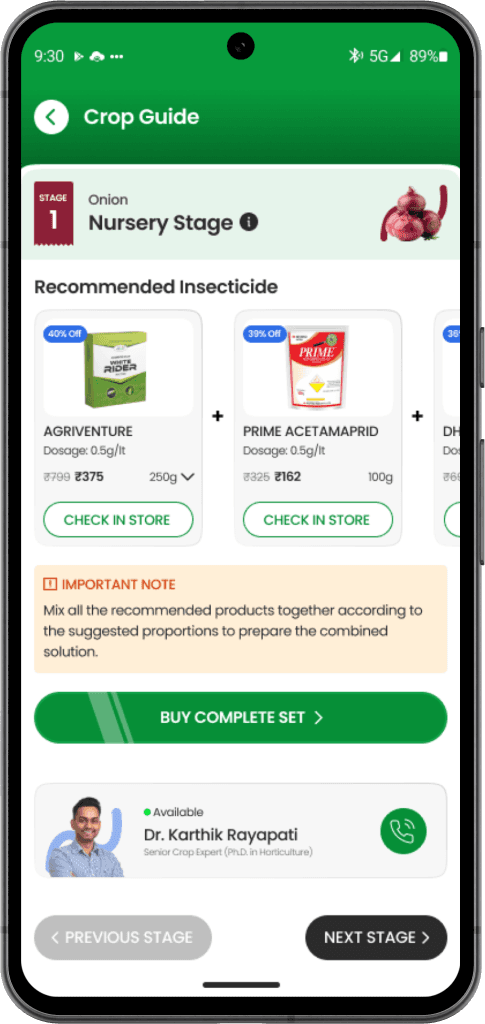
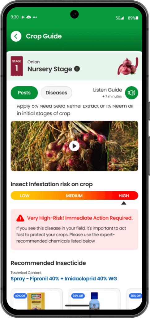
After discussing this issue with our agricultural experts, we came up with a new solution. Instead of listing recommended products as packages, we created technical content sections. These sections provided information about the specific chemical compositions needed to address different pest or disease. We then listed only those products containing the recommended chemical compositions, allowing farmers to choose from their trusted brands.
03. Increase Product Sales
Problem
Even though we clarify product selection, it doesn't seem effective or important enough to encourage users to buy the product.
Solution
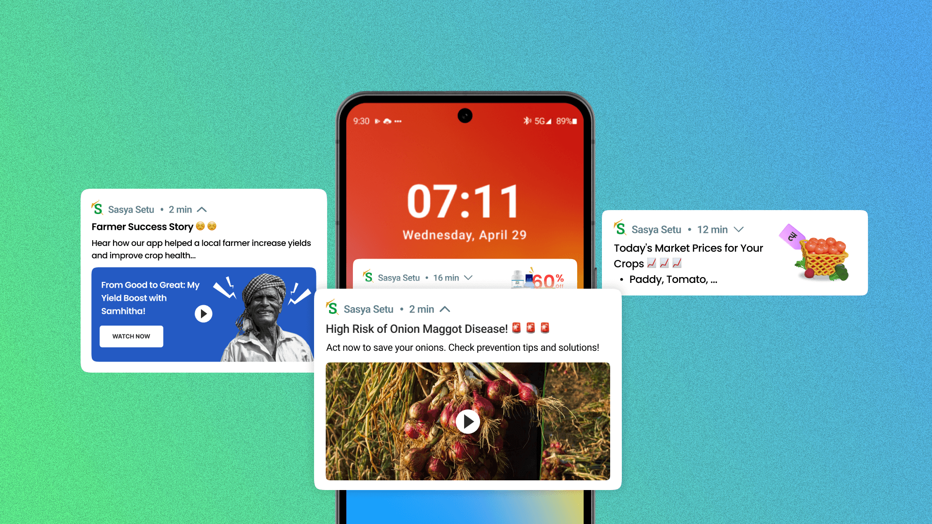
To boost product sales, I suggested adding a pest or disease risk indicator. This feature alerts users about risks and helps them quickly protect their crops using expert recommended products.
Visual Explorations - Final Screens
Visual design for this project was a real challenge. The hardest part was making sure it was easy for farmers to use.
Results and Impact
These are some success metrics from the first month after beta testing. I am not sharing the numbers publicly to maintain confidentiality.
30% increase in app engagement
01
20% boost in agri-input sales
02
Overwhelmingly positive feedback
03
Learnings & Takeaway
Building this app was a wonderful collaboration with the development and other teams. Together, we crafted a great user experience by applying key insights into human behavior and user engagement.
Empathy in Design
#1
Design with empathy, considering the user's perspective and experience. This can lead to more meaningful and impactful designs that truly address user needs.
Simplicity is Key
#2
Keep the design simple. Make it easy for users to navigate and find information quickly. Complexity can lead to confusion and frustration.
Feedback and Iteration
#3
Use feedback to continuously improve the design. Conduct usability tests and iterate on the design based on the results to ensure it meets user expectations.
Next Project
Effective Notifications: Our Secret Weapon to Bring Users Back!
Research
Design
